molecule · stable · since 2026-09
Accordion
Purpose
A list of disclosures under their headings, each independent by default: opening one closes no other, because closing what the reader had just opened surprises them. The items are data and the panel is a snippet, so the caller writes the content once and the component holds which are open.
When to use, when not
Use it for a list of questions and answers, a list of criteria with their explanation, any set of details the reader may skip. Do not use it for views of equal weight the user switches between (Tabs), nor for one panel alone (Disclosure).
Anatomy
- One Disclosure per item: a heading with the button, and the panel.
Props
| Name | Type | Default | What it does |
|---|---|---|---|
items | Item[] | The panels, in order. | |
level? | 2 | 3 | 4 | 5 | 6 | 3 | The heading level of every title. |
open? | string[] | [] | The ids of the panels open at first. |
exclusive? | boolean | false | Opening a panel closes the others. Off by default: independent panels surprise nobody. |
class? | string | '' | Layout classes only. |
panel | Snippet<[Item]> | The content of one panel, given its item. |
States
Independent, exclusive, and with a panel open at first.
exclusive
Opening a panel closes the others, for a caller that asked for it.
Light
Oui. Un rapport d'audit doit se relire des mois plus tard, par quelqu'un qui n'était pas là : la capture est ce qui rend le constat vérifiable.
Non. Les critères non applicables sont exclus du calcul : le taux rapporte les critères conformes au nombre de critères réellement applicables.
Le référentiel en impose huit au minimum, et elles doivent couvrir les gabarits et les parcours du site.
Dark
Oui. Un rapport d'audit doit se relire des mois plus tard, par quelqu'un qui n'était pas là : la capture est ce qui rend le constat vérifiable.
Non. Les critères non applicables sont exclus du calcul : le taux rapporte les critères conformes au nombre de critères réellement applicables.
Le référentiel en impose huit au minimum, et elles doivent couvrir les gabarits et les parcours du site.
320 px, light
Oui. Un rapport d'audit doit se relire des mois plus tard, par quelqu'un qui n'était pas là : la capture est ce qui rend le constat vérifiable.
Non. Les critères non applicables sont exclus du calcul : le taux rapporte les critères conformes au nombre de critères réellement applicables.
Le référentiel en impose huit au minimum, et elles doivent couvrir les gabarits et les parcours du site.
320 px, dark
Oui. Un rapport d'audit doit se relire des mois plus tard, par quelqu'un qui n'était pas là : la capture est ce qui rend le constat vérifiable.
Non. Les critères non applicables sont exclus du calcul : le taux rapporte les critères conformes au nombre de critères réellement applicables.
Le référentiel en impose huit au minimum, et elles doivent couvrir les gabarits et les parcours du site.
216 px, light
Oui. Un rapport d'audit doit se relire des mois plus tard, par quelqu'un qui n'était pas là : la capture est ce qui rend le constat vérifiable.
Non. Les critères non applicables sont exclus du calcul : le taux rapporte les critères conformes au nombre de critères réellement applicables.
Le référentiel en impose huit au minimum, et elles doivent couvrir les gabarits et les parcours du site.
Forced colours, captured
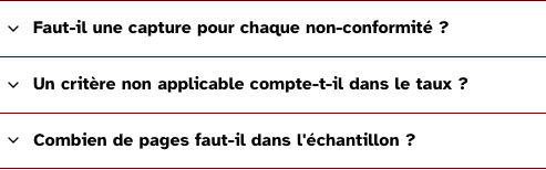
independent
Each panel opens and closes on its own; two can be open to compare them.
Light
Oui. Un rapport d'audit doit se relire des mois plus tard, par quelqu'un qui n'était pas là : la capture est ce qui rend le constat vérifiable.
Non. Les critères non applicables sont exclus du calcul : le taux rapporte les critères conformes au nombre de critères réellement applicables.
Le référentiel en impose huit au minimum, et elles doivent couvrir les gabarits et les parcours du site.
Dark
Oui. Un rapport d'audit doit se relire des mois plus tard, par quelqu'un qui n'était pas là : la capture est ce qui rend le constat vérifiable.
Non. Les critères non applicables sont exclus du calcul : le taux rapporte les critères conformes au nombre de critères réellement applicables.
Le référentiel en impose huit au minimum, et elles doivent couvrir les gabarits et les parcours du site.
320 px, light
Oui. Un rapport d'audit doit se relire des mois plus tard, par quelqu'un qui n'était pas là : la capture est ce qui rend le constat vérifiable.
Non. Les critères non applicables sont exclus du calcul : le taux rapporte les critères conformes au nombre de critères réellement applicables.
Le référentiel en impose huit au minimum, et elles doivent couvrir les gabarits et les parcours du site.
320 px, dark
Oui. Un rapport d'audit doit se relire des mois plus tard, par quelqu'un qui n'était pas là : la capture est ce qui rend le constat vérifiable.
Non. Les critères non applicables sont exclus du calcul : le taux rapporte les critères conformes au nombre de critères réellement applicables.
Le référentiel en impose huit au minimum, et elles doivent couvrir les gabarits et les parcours du site.
216 px, light
Oui. Un rapport d'audit doit se relire des mois plus tard, par quelqu'un qui n'était pas là : la capture est ce qui rend le constat vérifiable.
Non. Les critères non applicables sont exclus du calcul : le taux rapporte les critères conformes au nombre de critères réellement applicables.
Le référentiel en impose huit au minimum, et elles doivent couvrir les gabarits et les parcours du site.
Forced colours, captured
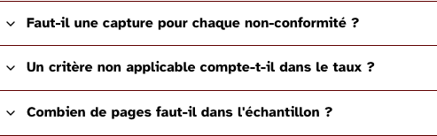
preset
The second panel is open at first render.
Light
Oui. Un rapport d'audit doit se relire des mois plus tard, par quelqu'un qui n'était pas là : la capture est ce qui rend le constat vérifiable.
Non. Les critères non applicables sont exclus du calcul : le taux rapporte les critères conformes au nombre de critères réellement applicables.
Le référentiel en impose huit au minimum, et elles doivent couvrir les gabarits et les parcours du site.
Dark
Oui. Un rapport d'audit doit se relire des mois plus tard, par quelqu'un qui n'était pas là : la capture est ce qui rend le constat vérifiable.
Non. Les critères non applicables sont exclus du calcul : le taux rapporte les critères conformes au nombre de critères réellement applicables.
Le référentiel en impose huit au minimum, et elles doivent couvrir les gabarits et les parcours du site.
320 px, light
Oui. Un rapport d'audit doit se relire des mois plus tard, par quelqu'un qui n'était pas là : la capture est ce qui rend le constat vérifiable.
Non. Les critères non applicables sont exclus du calcul : le taux rapporte les critères conformes au nombre de critères réellement applicables.
Le référentiel en impose huit au minimum, et elles doivent couvrir les gabarits et les parcours du site.
320 px, dark
Oui. Un rapport d'audit doit se relire des mois plus tard, par quelqu'un qui n'était pas là : la capture est ce qui rend le constat vérifiable.
Non. Les critères non applicables sont exclus du calcul : le taux rapporte les critères conformes au nombre de critères réellement applicables.
Le référentiel en impose huit au minimum, et elles doivent couvrir les gabarits et les parcours du site.
216 px, light
Oui. Un rapport d'audit doit se relire des mois plus tard, par quelqu'un qui n'était pas là : la capture est ce qui rend le constat vérifiable.
Non. Les critères non applicables sont exclus du calcul : le taux rapporte les critères conformes au nombre de critères réellement applicables.
Le référentiel en impose huit au minimum, et elles doivent couvrir les gabarits et les parcours du site.
Forced colours, captured
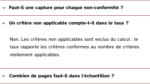
Accessibility contract
- Role and name: Disclosure’s, per panel.
- Keyboard, focus: Tab moves from button to button and into an open panel’s content; Enter and Space toggle. No arrow-key navigation: the panels are headings and buttons, and both already have their keys.
- Live regions: none.
Content rules
French. Titles are questions or noun phrases, each different from the others so the list of headings reads on its own.
Do and don’t
- Do give
levelthe level the titles hold in the page. - Do not set
exclusiveunless the panels really are alternatives; it costs a screen reader user the panel they opened to compare.
Examples
<Accordion items={questions} level={3}>
	{#snippet panel(item)}<p>{answers[item.id]}</p>{/snippet}
</Accordion>
Surfaces
- App: the questions of the help page and the criteria of the report; not ported yet.
- Site: the questions of the pricing page, once the site is ported.
Related
Disclosure, Tabs.
Decisions
- 2026-09-24: independent by default, exclusive on request, as the site’s accordéon demo argues.
Criteria held by construction
- 7.1, Chaque script est-il, si nécessaire, compatible avec les technologies d'assistance ?
Each panel is a Disclosure: a native button with aria-expanded and aria-controls, the state and the relation assistive technology already knows. - 9.1, Dans chaque page web, l'information est-elle structurée par l'utilisation appropriée de titres ?
Every title is a heading at the level the page gives, so the set reads as a list of sections in the outline. - 12.8, Dans chaque page web, l'ordre de tabulation est-il cohérent ?
A folded panel carries hidden and its content leaves the tab order, whatever the number of panels.
Tokens it reads
None of its own: the component draws with the base layer alone.