view · stable · app · since 2026-09
AppShell
Purpose
The frame of the application: a column of navigation on the left, the content area on the right, and what sits between them. The column holds every way to go somewhere, the foot says who is signed in and how to leave, the content area says when it is loading.
When to use, when not
Use it as the layout of every page a signed-in user sees. Not for the pages before sign-in, which take AuthShell; not for a document meant to be printed, which hides the column anyway.
Anatomy
- The top bar, on small screens only: the button that opens the drawer, and the mark.
- The column: the mark and the fold button above lg; the navigation landmark, with the home link, then one section per group of links, each with an icon, a title and its list; the foot with the address, the theme switch, the link out and the sign-out form.
- Folded, the column is a rail of icons. A section becomes a button that opens a panel beside the rail, holding the same list.
- Under lg, the column is a drawer, closed at first, with a backdrop button that closes it.
- The status region, outside the main landmark, that says a page is loading.
- The banner slot, above the content area.
- The content area, the main landmark, busy while a navigation loads.
Props
| Name | Type | Default | What it does |
|---|---|---|---|
home | NavLink | The first link of the column, the dashboard. Current on its exact path only. | |
sections | NavSection[] | The sections, in order. A section with no links and no `closed` is not rendered. | |
currentPath | string | The page's path, so the current link says so. | |
collapsed? | boolean | false | Folded to a rail at first render, as the server knows it. After that the button decides. |
oncollapse? | (collapsed: boolean) => void | Called when the user folds or unfolds, so the page can remember it. | |
busy? | boolean | false | A navigation is loading: aria-busy on the content area and the ring. |
announcement? | string | '' | What the status region says; empty when nothing loads. |
email | string | Who is signed in, in the column's foot. | |
logoutAction | string | Where the sign-out form posts. | |
logoutEnhance? | (form: HTMLFormElement) => { destroy?: () => void } | void | An action for the sign-out form, such as SvelteKit's `enhance` with its submit function already bound. | |
siteHref? | string | 'https://rgaa.dev' | A link out, in the foot. |
siteLabel? | string | 'rgaa.dev' | |
navLabel? | string | 'Navigation' | The navigation landmark's name. |
themeName? | string | 'theme' | The theme switch's group name; two shells on one page need two. |
banner? | Snippet | An announcement across the top of the content: the beta banner. | |
as? | 'main' | 'div' | 'main' | `main` on a page; `div` inside a page that already has one. |
children | Snippet |
States
The column open, the rail with one panel open, the closed section, and the busy content area.
busy
The content area while a navigation loads: aria-busy on the main, the rule at the top, and the status region saying what is loading.
Light
Chargement de la page Utilisateurs…
Audit Q2 2026, réaudit
Le contenu de la page, dans la zone principale.
Dark
Chargement de la page Utilisateurs…
Audit Q2 2026, réaudit
Le contenu de la page, dans la zone principale.
320 px, light
Chargement de la page Utilisateurs…
Audit Q2 2026, réaudit
Le contenu de la page, dans la zone principale.
320 px, dark
Chargement de la page Utilisateurs…
Audit Q2 2026, réaudit
Le contenu de la page, dans la zone principale.
216 px, light
Chargement de la page Utilisateurs…
Audit Q2 2026, réaudit
Le contenu de la page, dans la zone principale.
Forced colours, captured
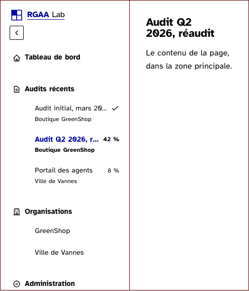
closed
The administration section closed to a user without the second factor: a sentence with the one link that opens it, and no link to a zone that refuses.
Light
Audit Q2 2026, réaudit
Le contenu de la page, dans la zone principale.
Dark
Audit Q2 2026, réaudit
Le contenu de la page, dans la zone principale.
320 px, light
Audit Q2 2026, réaudit
Le contenu de la page, dans la zone principale.
320 px, dark
Audit Q2 2026, réaudit
Le contenu de la page, dans la zone principale.
216 px, light
Audit Q2 2026, réaudit
Le contenu de la page, dans la zone principale.
Forced colours, captured
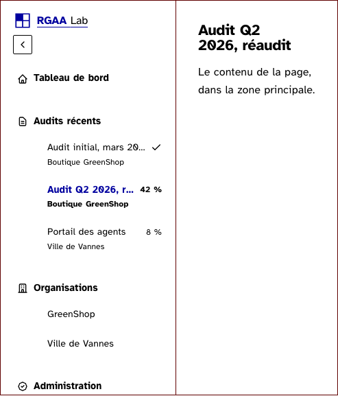
open
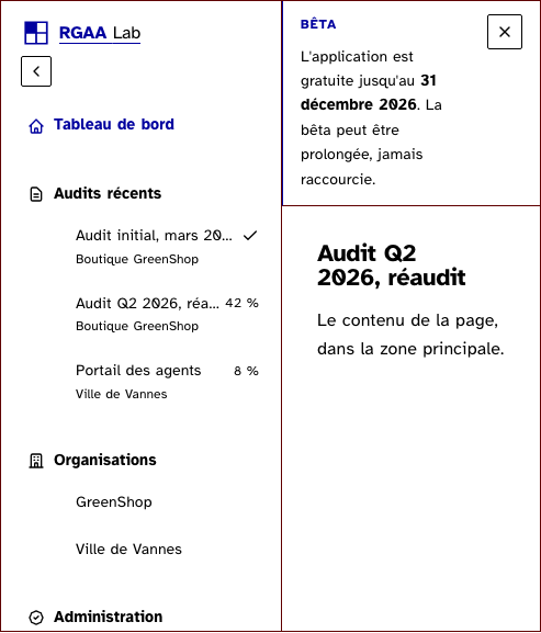
The column open, with the four sections of the lab: recent audits with their progress, the organisations, the administration, the settings. The current page is the second audit. Rendered as a div here, since this page already has a main.
Light
Audit Q2 2026, réaudit
Le contenu de la page, dans la zone principale.
Dark
Audit Q2 2026, réaudit
Le contenu de la page, dans la zone principale.
320 px, light
Audit Q2 2026, réaudit
Le contenu de la page, dans la zone principale.
320 px, dark
Audit Q2 2026, réaudit
Le contenu de la page, dans la zone principale.
216 px, light
Audit Q2 2026, réaudit
Le contenu de la page, dans la zone principale.
Forced colours, captured
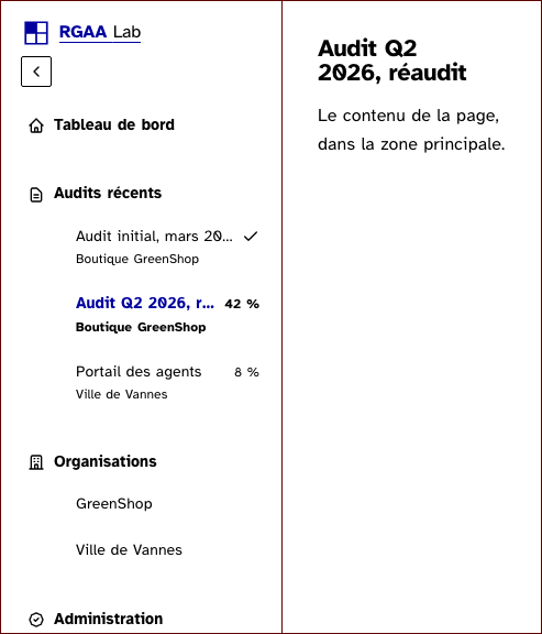
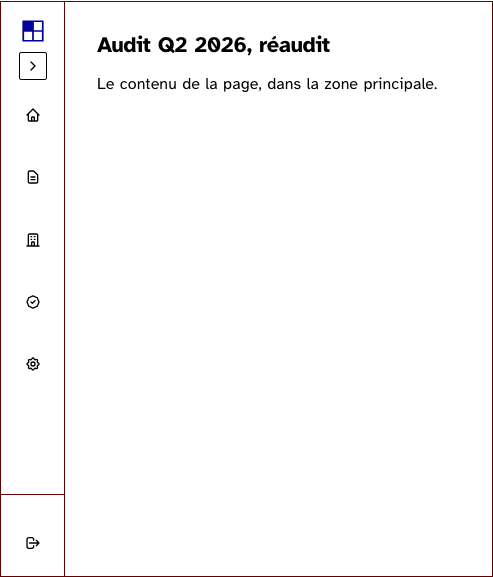
rail
The column folded to a rail of icons: each section is a button that opens a panel beside the rail. The rail is the layout above lg; below, the story shows the drawer.
Light
Audit Q2 2026, réaudit
Le contenu de la page, dans la zone principale.
Dark
Audit Q2 2026, réaudit
Le contenu de la page, dans la zone principale.
320 px, light
Audit Q2 2026, réaudit
Le contenu de la page, dans la zone principale.
320 px, dark
Audit Q2 2026, réaudit
Le contenu de la page, dans la zone principale.
216 px, light
Audit Q2 2026, réaudit
Le contenu de la page, dans la zone principale.
Forced colours, captured
withBanner
The banner slot above the content area, with the beta banner.
Light
Audit Q2 2026, réaudit
Le contenu de la page, dans la zone principale.
Dark
Audit Q2 2026, réaudit
Le contenu de la page, dans la zone principale.
320 px, light
Audit Q2 2026, réaudit
Le contenu de la page, dans la zone principale.
320 px, dark
Audit Q2 2026, réaudit
Le contenu de la page, dans la zone principale.
216 px, light
Audit Q2 2026, réaudit
Le contenu de la page, dans la zone principale.
Forced colours, captured
Accessibility contract
- Role and name:
navnamed bynavLabel; the content area ismainwithid="main-content"andtabindex="-1"on a page, adivinside a docs page; the status region is apwithrole="status", present and empty from the first render. - Keyboard, focus: the skip link’s target is the content area; the fold button and the rail buttons are buttons with
aria-expanded; Escape on a rail panel closes it and returns the focus to its button; Escape closes the drawer; a click outside a panel closes it; a navigation closes it, including the browser’s back. The closed drawer isvisibility: hidden, so its links leave the tab order. - Live regions: the status region says “Chargement de la page …” once the wait passes the page’s threshold; the shell writes what
announcementsays and nothing else. The page empties it, since SvelteKit’s announcer already says the title of the page that arrived. - The current link carries
aria-current="page"and a line on the left; a finished audit’s check carries a hidden “Terminé”. - The section titles are paragraphs tied to their lists by
aria-labelledby, never headings. - Reduced motion: the column’s slide and the chevron’s turn are cut.
- Print: the bar, the column and the backdrop leave the paper; the content area drops its gutters and its maximum width, since a printed document sets its own margins.
Content rules
French. Section labels are nouns (“Audits récents”, “Organisations”, “Paramètres”); the home link is “Tableau de bord”; the rail names of a closed section say the section and the gesture (“Administration : activer la vérification en deux étapes”). The closed sentence names the one link that opens the section, in the sentence’s own words.
Do and don’t
- Do give every section an icon, learnt while the word is still next to it.
- Do keep the sign-out a form that posts, never a link.
- Do write the busy state from a navigation helper with a threshold, never from every navigation.
- Do not put a heading in the column.
- Do not claim a menu role on the rail’s panels: they are disclosures.
- Do not put the status region inside the content area.
Examples
<AppShell
	home={{ href: '/lab', label: 'Tableau de bord' }}
	{sections}
	currentPath={page.url.pathname}
	collapsed={data.collapsed}
	oncollapse={(collapsed) => (document.cookie = `barre_repliee=${collapsed ? '1' : '0'}; path=/; max-age=31536000; samesite=lax`)}
	busy={navigation.busy}
	announcement={navigation.announcement}
	email={data.user.email}
	logoutAction="/auth/logout"
	logoutEnhance={(form) => enhance(form, occupe())}
>
	{#snippet banner()}<Banner label="Bêta" dismissKey="rgaa-banner-beta:2026-12-31">…</Banner>{/snippet}
	{@render children()}
</AppShell>
Surfaces
- App: the lab layout, every page under
/lab.
Related
BusyRegion, SkipLink, Banner, IconButton, ThemeSwitch, Logo.
Decisions
- 2026-09-25: the rail’s panels are disclosures, not menus, as the lab layout had decided: a menu role promises arrow keys, Home, End and type-ahead, and a promise half kept is worse than none.
- 2026-09-25: the fold is one layout, not two. Folding only narrows the column and cuts the text; every element’s middle stays on the same vertical line, so nothing jumps. The two measured margins that centre the mark and the button on the rail are kept as written.
- 2026-09-25: the panel is held by the strong line, where the layout drew a shadow; the direction has no elevation.
- 2026-09-25: the sign-out form takes an action from the page rather than a submit handler, so SvelteKit’s
enhanceand the page’s busy helper compose as they did. - 2026-09-27: a navigation closes the drawer as it closes a panel, and Escape gives the focus back to the menu button. The shell stays mounted across the lab’s routes, and on a phone a link tapped in the drawer loaded the page under the drawer and its veil.
Criteria held by construction
- 12.6, Les zones de regroupement de contenus présentes dans plusieurs pages web (zones d'en-tête, de navigation principale, de contenu principal, de pied de page et de moteur de recherche) peuvent-elles être atteintes ou évitées ?
The column is one navigation landmark with a name; the foot, which holds a form and a fieldset, sits outside it. - 12.7, Dans chaque page web, un lien d'évitement ou d'accès rapide à la zone de contenu principal est-il présent ?
The content area is the main landmark with the id the skip link targets and tabindex -1. - 12.8, Dans chaque page web, l'ordre de tabulation est-il cohérent ?
The mark, the fold button, the sections, the foot and the content follow in the DOM in the order the eye reads them, on every width. - 12.9, Dans chaque page web, la navigation ne doit pas contenir de piège au clavier. Cette règle est-elle respectée ?
Escape closes a rail panel and gives the focus back to its button; Escape closes the drawer; the closed drawer leaves the tab order. - 7.1, Chaque script est-il, si nécessaire, compatible avec les technologies d'assistance ?
A section folded to the rail is a button with aria-expanded and a panel it controls, a disclosure and not a menu; the fold button says its state the same way. - 10.7, Dans chaque page web, pour chaque élément recevant le focus, la prise de focus est-elle visible ?
Every link, button and the sign-out control keep the base layer's focus ring; the rail's icon-only controls have a hidden name. - 3.1, Dans chaque page web, l'information ne doit pas être donnée uniquement par la couleur. Cette règle est-elle respectée ?
The current page is said by aria-current and drawn by a line on the left, never by colour alone; a finished audit shows a check with a hidden word. - 11.1, Chaque champ de formulaire a-t-il une étiquette ?
The sign-out control is a submit button in a form, named by its word, hidden at the rail but never removed. - 9.1, Dans chaque page web, l'information est-elle structurée par l'utilisation appropriée de titres ?
The section titles are labels tied to their lists with aria-labelledby, not headings: the column comes before the page's h1. - 4.1, Chaque média temporel pré-enregistré a-t-il, si nécessaire, une transcription textuelle ou une audiodescription ?
The status region that says a page is loading sits outside the main landmark, since aria-busy on an ancestor would silence it.
Tokens it reads
- Colour:
--rl-action,--rl-backdrop,--rl-bg,--rl-c,--rl-ink,--rl-ink-soft,--rl-line,--rl-line-control,--rl-line-strong,--rl-sunken,--rl-surface - Typography:
--rl-weight-bold,--rl-text-sm,--rl-text-xs,--rl-leading-body,--rl-tracking-label - Spacing:
--rl-space-1,--rl-space-10,--rl-space-2,--rl-space-3,--rl-space-4,--rl-space-6,--rl-space-8 - Layout:
--rl-radius,--rl-border,--rl-border-strong,--rl-container-wide,--rl-z-drawer,--rl-z-sticky - Motion:
--rl-duration-base,--rl-ease
And 4 custom properties of its own, not tokens: --rl-app-shell-bar, --rl-app-shell-column, --rl-app-shell-height, --rl-app-shell-rail.