molecule · stable · site · since 2026-08
Card
Purpose
A card laid on the surface, separated from its neighbours by the hairline of the grid. With href, the whole card becomes the target.
When to use, when not
Use it inside a CardGrid for a set of comparable items: articles, services, capabilities. Do not use it alone as a framed box (that is Callout) or as a form wrapper.
Anatomy
- The item:
liin a list grid,articleotherwise. The grid decides. - The content, padded; a link covering the whole card when
hrefis set.
Props
| Name | Type | Default | What it does |
|---|---|---|---|
href? | string | The destination; the whole card becomes the link. | |
listItem? | boolean | Forces the `li` wrapper. Outside a list grid only: inside one, the grid says so. | |
children | Snippet |
States
Plain, as a link, inside a list or not.
inList
Inside a list grid the cards are list items; the grid says so.
Light
Dark
320 px, light
320 px, dark
216 px, light
Forced colours, captured

link
The whole card is the link.
Light
320 px, light
320 px, dark
216 px, light
Forced colours, captured

plain
Light
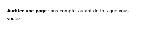
Auditer une page sans compte, autant de fois que vous voulez.
Dark
Auditer une page sans compte, autant de fois que vous voulez.
320 px, light
Auditer une page sans compte, autant de fois que vous voulez.
320 px, dark
Auditer une page sans compte, autant de fois que vous voulez.
216 px, light
Auditer une page sans compte, autant de fois que vous voulez.
Forced colours, captured
Accessibility contract
- Role and name: a list item or an article; with
href, a link whose name is the card’s text. - Keyboard: the link is one tab stop for the whole card.
- Focus: the ring of the base layer around the link.
- Live regions: none.
Content rules
A card that is a link opens with its title, so the link’s name starts with what it leads to.
Do and don’t
- Do let the grid decide
listItem; set it by hand only outside a grid. - Do not put a second link or a button inside a card that is a link.
Examples
<CardGrid list columns={3}>
	<Card href="/articles/outils">Les outils qui testent</Card>
	<Card href="/articles/methode">La méthode</Card>
</CardGrid>
Surfaces
- Site: 12 files (articles, services, capabilities).
- App: every form’s card, the empty states, the site and page cards that link, the sessions and tokens as list items; the report keeps the base layer’s class until it is a document.
Related
CardGrid.
Decisions
- 2026-08: the grid passes a flag during the construction of its cards rather than a Svelte context, which threw at hydration and blanked the pages (see
context.ts). - 2026-09-24: prop
listItem; the surface and the padding arerl-cardrules on the tokens. - 2026-09-24: the card draws its own hairline as an outline, so a grid needs no background and an incomplete row shows no painted cell.
Criteria held by construction
- 6.1, Chaque lien est-il explicite ?
When the card is a link, the whole card is the link and its text is the name: a clickable zone the size of a word is a defect of ergonomics as much as of accessibility. - 9.3, Dans chaque page web, chaque liste est-elle correctement structurée ?
Inside a list grid the card is a list item; the grid tells it, so a ul can never hold an article by mistake.