Une
molecule · stable · site · since 2026-08
CardGrid
Purpose
A grid of cards separated by a one-pixel hairline. Each card carries its line as an outline and the outlines meet in the one-pixel gap: the separation is a real stroke, not a border doubled between two neighbours, and an incomplete row shows no painted cell. Structure by the line, not by the shadow.
When to use, when not
Use it for two to four comparable cards side by side. Make it a list as soon as the cards are an enumeration. Do not use it for a single card.
Anatomy
- A
ulwithrole="list"(list mode) or adiv. - A grid with a one-pixel gap where the cards’ outlines meet; two, three or four columns from the small breakpoint, four folding to two below the large one.
Props
| Name | Type | Default | What it does |
|---|---|---|---|
columns? | 2 | 3 | 4 | 3 | Columns from the small breakpoint; one column below it. |
list? | boolean | false | Renders a `ul` announced as a list: as soon as the cards are an enumeration. |
children | Snippet |
States
Two to four columns, list or not.
four
Light
Deux
Trois
Quatre
Dark
Une
Deux
Trois
Quatre
320 px, light
Une
Deux
Trois
Quatre
320 px, dark
Une
Deux
Trois
Quatre
216 px, light
Une
Deux
Trois
Quatre
Forced colours, captured

list
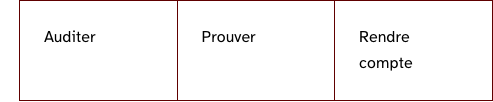
An enumeration: a ul announced with its count.
Light
- Auditer
- Prouver
- Rendre compte
Dark
- Auditer
- Prouver
- Rendre compte
320 px, light
- Auditer
- Prouver
- Rendre compte
320 px, dark
- Auditer
- Prouver
- Rendre compte
216 px, light
- Auditer
- Prouver
- Rendre compte
Forced colours, captured
three
Light
Une
Deux
Trois
Dark
Une
Deux
Trois
320 px, light
Une
Deux
Trois
320 px, dark
Une
Deux
Trois
216 px, light
Une
Deux
Trois
Forced colours, captured

two
Light
Une
Deux
Dark
Une
Deux
320 px, light
Une
Deux
320 px, dark
Une
Deux
216 px, light
Une
Deux
Forced colours, captured

Accessibility contract
- Role and name: a list when
listis set, announced with its number of items; a plain group otherwise.role="list"is explicit because a reset that removes bullets makes some screen readers drop the list semantics. - Keyboard, focus, live regions: none of its own.
Content rules
None.
Do and don’t
- Do choose the list form for enumerations: three capabilities, five articles.
- Do not put anything but cards inside.
Examples
<CardGrid list columns={3}>
	<Card>...</Card>
	<Card>...</Card>
	<Card>...</Card>
</CardGrid>
Surfaces
- Site: 12 files.
- App: the organisation’s sites, as a list grid.
Related
Card.
Decisions
- 2026-08: the grid announces to its cards whether they are list items, so the two choices cannot disagree.
- 2026-09-24: props
columnsandlist; the grid and its breakpoints arerl-card-gridrules. - 2026-09-24: the hairline moved from a background behind the grid to an outline on each card, because the background painted the empty cells of a five-card row in three columns on the public site.
Criteria held by construction
- 9.3, Dans chaque page web, chaque liste est-elle correctement structurée ?
An enumeration of cards is a real list (ul with role list), announced with its count; the grid passes the fact to its cards so the markup cannot be half a list.
Tokens it reads
- Layout:
--rl-border