molecule · stable · site · since 2026-08
DataTable
Purpose
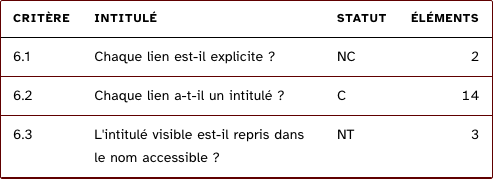
A data table. A table written by hand almost always misses one of four things, and all four are criteria of theme 5: the caption, the declared headers, a scroll reachable at the keyboard, aligned figures. The component makes them impossible to miss.
When to use, when not
Use it for a table whose rows are records of the same shape and whose cells are values or small snippets. When cells need row groups, spanning headers or a sticky column, write the table by hand with the base classes inside a scroll region instead.
Anatomy
- The scroll region component, framed and named by the caption.
- A table with a caption, visible or visually hidden.
- Column headers with
scope="col", small capitals; numeric columns right-aligned in tabular numerals. - Rows keyed by an identity, cells rendered from the raw value or a snippet.
- Or, when there are no rows, the empty snippet.
Props
Props of DataTable| Name | Type | Default | What it does |
|---|
caption | string | | The table's title. Required: that is criterion 5.4. |
|---|
captionHidden? | boolean | false | Hides the caption on screen without removing it from the accessible name. |
|---|
columns | Column[] | | The columns, in order; `key` reads the row, `label` is the header. |
|---|
rows | Array<Record<string, unknown>> | | The records, one per row. |
|---|
rowKey | string | | The key that identifies a row, so Svelte never mixes two up. |
|---|
cell? | Snippet<[{ row: Record<string, unknown>; column: Column }]> | | Renders a cell when the raw value is not enough. |
|---|
empty? | Snippet | | Shown instead of the table when there are no rows. |
|---|
States
Plain, with a custom cell, empty, caption hidden.
captionHidden
The caption stays in the accessible name when the heading above already says it.
empty
Nothing to show: the empty snippet replaces the table, so a screen reader does not enter an empty grid.
Light
Aucun critère dans ce thème.
Dark
Aucun critère dans ce thème.
Accessibility contract
- Role and name: a table named by its caption, inside a region named “caption (zone défilante)“.
- Keyboard: Tab reaches the region; a screen reader’s table navigation reads headers with each cell.
- Focus: the ring of the base layer around the region.
- No zebra striping: a second background is a second contrast to check, for a gain the hairline already gives.
Content rules
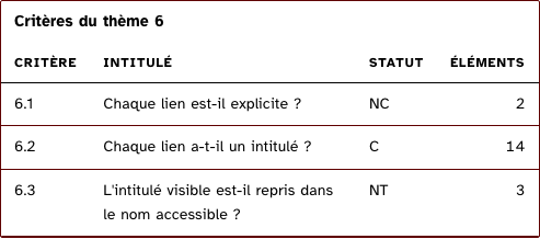
The caption names the data, not the table (“Critères du thème 6”, not “Tableau”). Column headers are nouns.
Do and don’t
- Do mark numeric columns, so figures align and compare.
- Do not hide the caption unless the heading just above says the same thing.
Examples
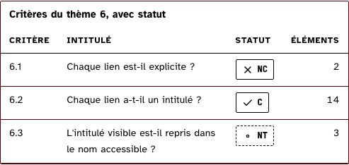
<DataTable caption="Critères du thème 6" {columns} rows={criteres} rowKey="code">
	{#snippet cell({ row, column })}
		{#if column.key === 'status'}<StatusChip status={row.status} short />{:else}{row[column.key]}{/if}
	{/snippet}
</DataTable>
Surfaces
- Site: the gallery only. The app’s tables use the base classes by hand because of their row groups and sticky columns.
Related
ScrollRegion.
Decisions
- 2026-08: the caption is required, with no default, so a table cannot be added without naming it.
- 2026-09-24: English props (
caption, columns with key, label, numeric, rows, rowKey, cell, empty); the scroll wrapper is the scroll region component rather than a second copy of its markup.
Criteria held by construction
- 5.4, Pour chaque tableau de données ayant un titre, le titre est-il correctement associé au tableau de données ?
The caption is a required prop: a data table has a title that tells it from the others on the page. - 5.6, Pour chaque tableau de données, chaque en-tête de colonnes et chaque en-tête de lignes sont-ils correctement déclarés ?
Every column header is a th with scope, so every cell knows what it is about. - 12.9, Dans chaque page web, la navigation ne doit pas contenir de piège au clavier. Cette règle est-elle respectée ?
The table sits in the scroll region component, focusable and named, so a wide one can be scrolled with the keyboard alone.
Tokens it reads
- Colour:
--rl-ink, --rl-ink-soft, --rl-line, --rl-line-strong - Typography:
--rl-weight-bold, --rl-text-sm, --rl-text-xs, --rl-tracking-label - Spacing:
--rl-space-2, --rl-space-3 - Layout:
--rl-border, --rl-border-strong
Seen in patterns