atom · stable · app, extension · since 2026-09
DisabledReason
Purpose
A control that refuses, and says why next to it. The component writes the reason as a visible sentence and hands the control the two attributes that make the refusal honest: disabled, and aria-describedby pointing at the sentence. Button carries the same contract as its own reason prop; this component is for every other control, and for a group that shares one reason.
When to use, when not
Use it around an icon button, a switch, a field or a group of controls that cannot be used until a condition is met: off the audited page, a report already published, an audit not finished. Use Button’s reason prop for a lone button. Do not use it for a control that is busy (that is busy, which keeps the focus), and do not use it to hide a control the user can never use: remove that one.
Anatomy
- The wrapper, the reason beside or under the control.
- The control, rendered by the snippet with the marks spread on it.
- The reason, a sentence in the soft ink, with the id the control describes itself by.
Props
| Name | Type | Default | What it does |
|---|---|---|---|
reason | string | Why the control is unavailable: a sentence that says what to do first ("Terminez l'audit pour publier."). | |
layout? | 'beside' | 'under' | 'beside' | `beside` writes the reason next to the control; `under` writes it below, for a full-width control or a group. |
class? | string | '' | Layout classes only. |
children | Snippet<[DisabledMarks]> | The control, which spreads the marks it receives: `{#snippet children(marks)}<IconButton {...marks} />{/snippet}`. |
States
An icon button, a full-width control with the reason under it, and a group sharing one reason.
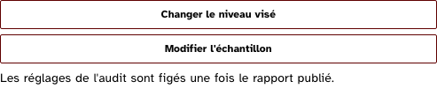
group
A group of controls that share one reason: the marks go on each, the sentence is written once.
Light
Dark
320 px, light
320 px, dark
216 px, light
Forced colours, captured
iconButton
An icon button that refuses: the marks it spreads set disabled and tie the sentence, so a reader hears the name then the reason.
Light
Dark
320 px, light
320 px, dark
216 px, light
Forced colours, captured

stacked
A full-width control with the reason under it, for a narrow panel.
Light
Dark
320 px, light
320 px, dark
216 px, light
Forced colours, captured

Accessibility contract
- Role and name: the control’s own; the sentence is its description.
- Keyboard, focus: a disabled control leaves the tab order, as the platform does; the reason stays readable by the virtual cursor and in the description.
- Live regions: none. A reason that changes is read the next time the control is reached; a page that wants it announced at once writes it in a LiveRegion too.
Content rules
French. The reason says what to do first, in the imperative: “Terminez l’audit pour publier.”, “Revenez à la page auditée pour capturer.”. Never “Indisponible” alone, never the negative fact (“Rapport non relu”).
Do and don’t
- Do spread the marks on every control of a group; the sentence is written once.
- Do not write the reason in a
title: a disabled element gets no hover, and a tooltip needs a pointer. - Do not grey the control with opacity; the marks and the tokens’ disabled rules do the drawing.
Examples
<DisabledReason reason="Revenez à la page auditée pour capturer.">
	{#snippet children(marks)}<IconButton label="Capturer l'élément" name="document" {...marks} />{/snippet}
</DisabledReason>
Surfaces
- App: the audit settings once the report is published, the export buttons of an unfinished audit.
- Extension: the wizard buttons of the theme rows while the tab is off the audited page.
Related
Button, IconButton.
Decisions
- 2026-09-26: the snippet receives the marks rather than the component wrapping the control in a fieldset: a
fieldset disabledwould work for native controls only, and would put a group role around one button. - 2026-09-26:
Buttonkeeps its ownreasonprop rather than composing this component: nine of ten reasons in the product sit on a button, and one prop reads better than a snippet.
Criteria held by construction
- 11.10, Dans chaque formulaire, le contrôle de saisie est-il utilisé de manière pertinente ?
The reason is tied to the control by aria-describedby: a reader hears why the control refuses, next to its name, and not only a disabled state. - 3.1, Dans chaque page web, l'information ne doit pas être donnée uniquement par la couleur. Cette règle est-elle respectée ?
The refusal is a sentence, not a greyed look: the soft ink of the control only confirms what the words say. - 10.11, Pour chaque page web, les contenus peuvent-ils être présentés sans avoir recours à un défilement vertical pour une fenêtre ayant une hauteur de 256px ou à un défilement horizontal pour une fenêtre ayant une largeur de 320px ?
The sentence wraps under the control on a narrow screen; nothing is cut.
Tokens it reads
- Colour:
--rl-ink-soft - Typography:
--rl-text-sm - Spacing:
--rl-space-1-5,--rl-space-2,--rl-space-3