molecule · stable · since 2026-09
Disclosure
Purpose
A heading that opens and closes a panel. The accessible version is a native button that says its state and a panel that is really hidden when folded; the component is that and nothing more, with the button inside the heading so the outline stays intact.
When to use, when not
Use it for a detail the reader may skip: the explanation under a criterion, a derogation’s justification, a long list folded by default. Do not use it for content the page needs read (show it), for a set of exclusive panels (Accordion) or for views of equal weight (Tabs).
Anatomy
- A heading, at the level the page gives it, holding the button.
- The button, with the chevron and the title;
aria-expandedsays the state. - The panel,
hiddenwhen folded, named as the button’saria-controlstarget.
Props
| Name | Type | Default | What it does |
|---|---|---|---|
title | string | The title, as the button's text. A noun phrase or a question. | |
level? | 2 | 3 | 4 | 5 | 6 | 3 | The heading level the title takes in the page's outline. |
open? | boolean | false | Whether the panel is shown; bindable. |
ontoggle? | (open: boolean) => void | Called after each toggle, with the new state. | |
class? | string | '' | Layout classes only. |
children | Snippet | The panel. |
States
Closed, open, and at another heading level.
closed
The button says its state with aria-expanded; the panel carries hidden, so nothing inside is reachable.
Light
Oui. Un rapport d'audit doit se relire des mois plus tard, par quelqu'un qui n'était pas là : la capture est ce qui rend le constat vérifiable.
Dark
Oui. Un rapport d'audit doit se relire des mois plus tard, par quelqu'un qui n'était pas là : la capture est ce qui rend le constat vérifiable.
320 px, light
Oui. Un rapport d'audit doit se relire des mois plus tard, par quelqu'un qui n'était pas là : la capture est ce qui rend le constat vérifiable.
320 px, dark
Oui. Un rapport d'audit doit se relire des mois plus tard, par quelqu'un qui n'était pas là : la capture est ce qui rend le constat vérifiable.
216 px, light
Oui. Un rapport d'audit doit se relire des mois plus tard, par quelqu'un qui n'était pas là : la capture est ce qui rend le constat vérifiable.
Forced colours, captured

level
The heading level follows the page: here a level 2, since the story has no parent heading.
Light
Le référentiel en impose huit au minimum, et elles doivent couvrir les gabarits et les parcours du site.
Dark
Le référentiel en impose huit au minimum, et elles doivent couvrir les gabarits et les parcours du site.
320 px, light
Le référentiel en impose huit au minimum, et elles doivent couvrir les gabarits et les parcours du site.
320 px, dark
Le référentiel en impose huit au minimum, et elles doivent couvrir les gabarits et les parcours du site.
216 px, light
Le référentiel en impose huit au minimum, et elles doivent couvrir les gabarits et les parcours du site.
Forced colours, captured
open
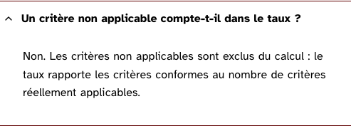
Open at first render, for a panel the page wants read.
Light
Non. Les critères non applicables sont exclus du calcul : le taux rapporte les critères conformes au nombre de critères réellement applicables.
Dark
Non. Les critères non applicables sont exclus du calcul : le taux rapporte les critères conformes au nombre de critères réellement applicables.
320 px, light
Non. Les critères non applicables sont exclus du calcul : le taux rapporte les critères conformes au nombre de critères réellement applicables.
320 px, dark
Non. Les critères non applicables sont exclus du calcul : le taux rapporte les critères conformes au nombre de critères réellement applicables.
216 px, light
Non. Les critères non applicables sont exclus du calcul : le taux rapporte les critères conformes au nombre de critères réellement applicables.
Forced colours, captured
Accessibility contract
- Role and name: a button, named by the title;
aria-expandedfor the state,aria-controlsfor the panel. The heading keeps its level. - Keyboard, focus: Enter and Space toggle. The focus stays on the button. The panel’s content is in the tab order only when shown.
- Live regions: none; the state change is announced by the button itself.
- Motion: the chevron turns under motion only.
Content rules
French. The title is a noun phrase or a question, the same whether the panel is open or closed: never “Afficher” that becomes “Masquer”, the state is already said.
Do and don’t
- Do give the heading the level its place in the outline requires.
- Do not open a panel on hover or on focus.
- Do not close the siblings: that is Accordion, and it surprises whoever was reading.
Examples
<Disclosure title="Pourquoi ce critère est non applicable" level={4}>
	<p>La page ne contient aucun média temporel.</p>
</Disclosure>
Surfaces
- App: the criteria of each theme on the audited page, folded under the theme’s figures.
- Extension: the derogation panel of the wizards and the theme rows of the sidebar, when the panel is on Svelte.
Related
Accordion, Tabs.
Decisions
- 2026-09-24:
hiddenand not a height of zero, as the site’s accordéon demo teaches; the demo is the source of this component. - 2026-09-24: the level is a prop, since a heading at the wrong level is the fault the product finds most on other sites.
Criteria held by construction
- 7.1, Chaque script est-il, si nécessaire, compatible avec les technologies d'assistance ?
A native button with aria-expanded and aria-controls: the state and the relation are the ones assistive technology already knows, nothing is invented. - 7.3, Chaque script est-il contrôlable par le clavier et par tout dispositif de pointage ?
A button toggles on Enter and Space by itself; there is no key handler to get wrong. - 9.1, Dans chaque page web, l'information est-elle structurée par l'utilisation appropriée de titres ?
The button sits inside the heading, so the title keeps its level in the page's outline and a reader jumps between panels by headings. - 12.8, Dans chaque page web, l'ordre de tabulation est-il cohérent ?
A folded panel carries hidden: its links leave the tab order with it, so Tab never lands on content nobody sees.
Tokens it reads
- Colour:
--rl-action,--rl-ink,--rl-ink-soft,--rl-line - Typography:
--rl-weight-bold,--rl-text-base - Spacing:
--rl-space-1,--rl-space-2-5,--rl-space-3,--rl-space-4,--rl-space-8 - Layout:
--rl-border - Motion:
--rl-duration-fast,--rl-ease