molecule · stable · since 2026-09
ErrorSummary
Purpose
The list of a form’s errors at its top, focused at submission, each entry a link to the field at fault. The pattern is GOV.UK’s: the summary says how many errors there are and where, the inline message says what to correct, where one corrects.
When to use, when not
Use it on every form with more than one field that can fail. Do not use it for a single field’s error (Field shows it), for a success (LiveRegion), or as a live region: it takes the focus, so it is not a status message.
Anatomy
- The heading, with the count, which takes the focus.
- The list, one link per error, with the field’s message.
- The line of non-conformity around, no fill.
Props
| Name | Type | Default | What it does |
|---|---|---|---|
errors | ErrorItem[] | The errors, in the form's order. Nothing renders when empty. Set it on submit, not on input: the summary takes the focus each time. | |
title? | string | The heading; by default "Il y a un problème" or "Il y a N problèmes". | |
level? | 2 | 3 | 4 | 2 | The heading level, from the form's place in the outline. |
class? | string | '' | Layout classes only. |
States
A form that submits: no error, two errors, one error, saved.
form
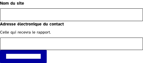
Submit with the fields empty: the summary appears, takes the focus and links to each field; the message stays under each field too. Correct and submit again.
Light
Dark
320 px, light
320 px, dark
216 px, light
Forced colours, captured
Accessibility contract
- Role and name: a heading at the level given, inside a plain block. No
role="alert", noaria-live. - Keyboard, focus: the heading takes the focus when the list is set; it is never a Tab stop. Each entry is a link; Enter moves the focus to the field.
- Live regions: none, by design.
Content rules
French. The heading counts: “Il y a un problème”, “Il y a 3 problèmes”. Each entry is the field’s message, which says what to write and gives an example (criterion 11.11).
Do and don’t
- Do set
errorson submit and only then; the summary takes the focus each time. - Do give each error the id of its control, the one Field puts on the input.
- Do not add a live region around it, nor a role.
- Do not validate on each keystroke into the summary.
Examples
<form novalidate onsubmit={submit}>
	<ErrorSummary {errors} />
	<Field id="name" label="Nom du site" bind:value={name} error={errorOf('name')} />
	<Button type="submit">Enregistrer</Button>
</form>
Surfaces
- App: every form of the auth pages and the settings; not ported yet.
Related
Field, LiveRegion, Alert.
Decisions
- 2026-09-24: the focus goes to the heading and the link replays the focus move, as the site’s demo does, since a router that intercepts internal links hides what the anchor does alone.
Criteria held by construction
- 11.10, Dans chaque formulaire, le contrôle de saisie est-il utilisé de manière pertinente ?
The summary is how the form reports its input control: every error is listed, tied to its field, and the focus goes to the list at submission. - 11.11, Dans chaque formulaire, le contrôle de saisie est-il accompagné, si nécessaire, de suggestions facilitant la correction des erreurs de saisie ?
The entries repeat the field messages, which say what to write, so the correction is suggested where the errors are counted. - 7.5, Dans chaque page web, les messages de statut sont-ils correctement restitués par les technologies d'assistance ?
The summary takes the focus, so it is not a status message and carries neither role alert nor aria-live; announcing it twice would be the fault. - 12.8, Dans chaque page web, l'ordre de tabulation est-il cohérent ?
Each entry is a link that puts the focus on the field at fault, so the correction path follows the reading order.
Tokens it reads
- Colour:
--rl-nc,--rl-focus,--rl-focus-offset,--rl-focus-width - Typography:
--rl-weight-bold,--rl-text-lg - Spacing:
--rl-space-1-5,--rl-space-2,--rl-space-4,--rl-space-5 - Layout:
--rl-radius,--rl-border-strong