molecule · stable · site, app · since 2026-08
Field
Purpose
A form field, label included. It exists to make impossible four faults the RGAA sanctions and that a hand-written field repeats endlessly: an unassociated label, a required mark by colour or asterisk only, an error not tied to its field, a help text shown but never announced.
When to use, when not
Use it for every text-like input: text, email, password, url, number, tel, search, and multi-line text. For a choice among options use native radios, checkboxes or a select with their own components; for a search form with a button, the search field component.
Anatomy
- The label, visible, with the required mark: an asterisk hidden from assistive technology and the word “(obligatoire)” visually hidden.
- The hint, announced with the field.
- The input or the textarea, with
aria-describedbylisting the error then the hint, andaria-invalidwhen there is an error. - The error, with the cross icon and the message.
Props
| Name | Type | Default | What it does |
|---|---|---|---|
id | string | The control's id; the label's `for` is the same value. | |
label | string | The visible label, a noun. | |
type? | 'text' | 'email' | 'password' | 'url' | 'number' | 'tel' | 'search' | 'text' | The input type; a choice among options is another component. |
value? | string | undefined | The value, bindable; absent reads as empty. | |
name? | string | The name sent with the form. | |
required? | boolean | false | Required: the word goes into the accessible name and the attribute onto the control. |
hint? | string | undefined | A help sentence, announced with the field. | |
error? | string | undefined | The error message; its presence alone marks the field invalid. Undefined when the field is fine, so a form passes what its validation computed. | |
autocomplete? | FullAutoFill | Typed as the closed list of the standard rather than a string: autocomplete is criterion 11.13, and a typo in it is silent, the browser ignores the unknown value and the field loses its autofill with nothing to say so. | |
placeholder? | string | A hint inside the control, never the only place a format is said. | |
multiline? | boolean | false | Renders a textarea rather than an input. |
rows? | number | 4 | The textarea's visible rows. |
minlength? | number | The shortest value accepted; the browser checks it before the server does. | |
maxlength? | number | The longest value accepted. | |
inputmode? | HTMLInputAttributes['inputmode'] | The keyboard a phone opens: `numeric` for a code. | |
autofocus? | boolean | false | Takes the focus at load. Justified on a page that holds this one field and nothing else, such as the verification code; nowhere else. |
code? | boolean | false | A code the user copies or types once: the mono face, spaced, larger. |
children? | Snippet | Anything to render under the field, such as a character count. |
States
Text, email, password, required, with hint, in error, multi-line.
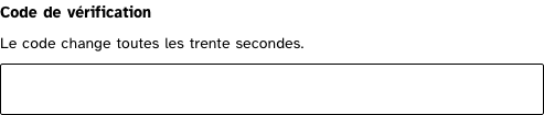
code
A code: the numeric keyboard on a phone, the system offering the code, the mono face spaced so the digits count.
Light
Le code change toutes les trente secondes.
Dark
Le code change toutes les trente secondes.
320 px, light
Le code change toutes les trente secondes.
320 px, dark
Le code change toutes les trente secondes.
216 px, light
Forced colours, captured
email
Light
Dark
320 px, light
320 px, dark
216 px, light
Forced colours, captured

error
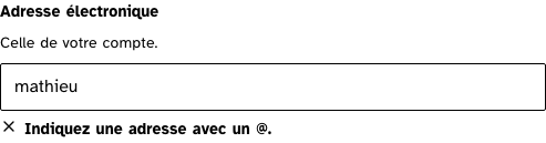
aria-invalid on the field, the message tied by aria-describedby and read as an alert.
Light
Celle de votre compte.
Indiquez une adresse avec un @.
Dark
Celle de votre compte.
Indiquez une adresse avec un @.
320 px, light
Celle de votre compte.
Indiquez une adresse avec un @.
320 px, dark
Celle de votre compte.
Indiquez une adresse avec un @.
216 px, light
Forced colours, captured
multiline
Light
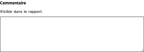
Visible dans le rapport.
Dark
Visible dans le rapport.
320 px, light
Visible dans le rapport.
320 px, dark
Visible dans le rapport.
216 px, light
Forced colours, captured
required
The asterisk is hidden from assistive technology; the word "(obligatoire)" is in the name.
Light
Dark
320 px, light
320 px, dark
216 px, light
Forced colours, captured

text
Light
Dark
320 px, light
320 px, dark
216 px, light
Forced colours, captured

withHint
Light
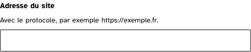
Avec le protocole, par exemple https://exemple.fr.
Dark
Avec le protocole, par exemple https://exemple.fr.
320 px, light
Avec le protocole, par exemple https://exemple.fr.
320 px, dark
Avec le protocole, par exemple https://exemple.fr.
216 px, light
Forced colours, captured
Accessibility contract
- Role and name: a textbox named by its label, “(obligatoire)” included when required.
- Description: the error first, then the hint, so what blocks is heard first.
- Keyboard: native.
- Focus: the ring of the base layer; the field’s border turns to the action colour.
- Live regions: the error carries
role="alert"so that a correction is announced without moving the focus.
Content rules
Labels are nouns (“Adresse électronique”), hints are sentences that say the format, errors say what to do (“Indiquez une adresse avec un @”).
Do and don’t
- Do give a hint for any format the user could not guess.
- Do not rely on the placeholder for anything the user must keep in mind.
Examples
<Field id="courriel" label="Adresse électronique" type="email" autocomplete="email" required bind:value={courriel} />
<Field id="commentaire" label="Commentaire" multiline rows={6} hint="Visible dans le rapport." bind:value={commentaire} />
Surfaces
- Site: the gallery; the contact and beta forms still write their fields by hand.
- App: every form, from sign-in to the report’s parameters; no label or input is written by hand any more.
Related
Button, Alert, Icon.
Decisions
- 2026-08: the error is announced before the hint, because it is what blocks.
- 2026-09-24: English props (
required,hint,error,multiline,rows); the error’s symbol is the cross icon; the control’s height comes from padding and font, never from a pixel value, so zoomed text zooms the field.
Criteria held by construction
- 11.1, Chaque champ de formulaire a-t-il une étiquette ?
for and id come from the same prop, so a label cannot be left unassociated. - 11.2, Chaque étiquette associée à un champ de formulaire est-elle pertinente ?
The label is visible and never replaced by a placeholder, which disappears at the first keystroke. - 11.10, Dans chaque formulaire, le contrôle de saisie est-il utilisé de manière pertinente ?
Required is in the accessible name and in the attribute; the error is tied to the field with aria-describedby and aria-invalid. - 11.13, La finalité d'un champ de saisie peut-elle être déduite pour faciliter le remplissage automatique des champs avec les données de l'utilisateur ?
autocomplete is typed as the closed list of the standard, so a typo cannot silently switch autofill off.
Tokens it reads
- Colour:
--rl-action,--rl-ink,--rl-ink-soft,--rl-line-control,--rl-nc,--rl-surface - Typography:
--rl-font-mono,--rl-weight-bold,--rl-text-base,--rl-text-lg,--rl-text-sm - Spacing:
--rl-space-1-5,--rl-space-2,--rl-space-3 - Layout:
--rl-radius,--rl-border