atom · stable · extension · since 2026-09
GlossaryTerm
Purpose
A term of the referential inside a wizard’s sentence, with its definition a press away, in the flow.
When to use, when not
Use it for a word of the referential the auditor may not know (“alternative textuelle”, “contexte du lien”). Not for a help sentence about the whole question, which is the Question’s help line, and not for a tooltip on a control.
Anatomy
- The term, a button with a dotted line under it.
- The definition, a block under the sentence, hidden until pressed.
Props
| Name | Type | Default | What it does |
|---|---|---|---|
term | string | The term as written in the sentence. | |
open? | boolean | false | Open at first; bindable. |
children | Snippet | The definition. |
States
Closed, and open.
closed
Light
L’Le texte associé à une image, restitué à sa place par un lecteur d’écran. de cette image est-elle pertinente ?
Dark
L’Le texte associé à une image, restitué à sa place par un lecteur d’écran. de cette image est-elle pertinente ?
320 px, light
L’Le texte associé à une image, restitué à sa place par un lecteur d’écran. de cette image est-elle pertinente ?
320 px, dark
L’Le texte associé à une image, restitué à sa place par un lecteur d’écran. de cette image est-elle pertinente ?
216 px, light
L’Le texte associé à une image, restitué à sa place par un lecteur d’écran. de cette image est-elle pertinente ?
Forced colours, captured

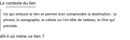
open
The definition open under the sentence, in the flow.
Light
Le Ce qui entoure le lien et permet d’en comprendre la destination : la phrase, le paragraphe, la cellule ou l’en-tête de tableau, le titre qui précède. dit-il où mène ce lien ?
Dark
Le Ce qui entoure le lien et permet d’en comprendre la destination : la phrase, le paragraphe, la cellule ou l’en-tête de tableau, le titre qui précède. dit-il où mène ce lien ?
320 px, light
Le Ce qui entoure le lien et permet d’en comprendre la destination : la phrase, le paragraphe, la cellule ou l’en-tête de tableau, le titre qui précède. dit-il où mène ce lien ?
320 px, dark
Le Ce qui entoure le lien et permet d’en comprendre la destination : la phrase, le paragraphe, la cellule ou l’en-tête de tableau, le titre qui précède. dit-il où mène ce lien ?
216 px, light
Le Ce qui entoure le lien et permet d’en comprendre la destination : la phrase, le paragraphe, la cellule ou l’en-tête de tableau, le titre qui précède. dit-il où mène ce lien ?
Forced colours, captured
Accessibility contract
- Role and name: a
buttonnamed by the term with “(définition)” hidden after it;aria-expandedsays the state andaria-controlsnames the block. - Keyboard, focus: Tab reaches it, Enter or Space toggles; the focus stays on the button.
- Live regions: none; the block opens in the flow, under the sentence.
Content rules
French; the term as the referential’s glossary writes it, the definition quoted from it or one sentence of the product’s.
Do and don’t
- Do keep the definition short; the glossary entry on the site is the long version.
- Do not turn the term into a link: leaving the panel loses the audit in progress.
Examples
<p>L'<GlossaryTerm term="alternative textuelle">Le texte associé à une image, restitué à sa place par un lecteur d'écran.</GlossaryTerm> décrit-elle l'image ?</p>Surfaces
- Extension: the wizard questions.
Related
Disclosure, Question, Tooltip.
Decisions
- 2026-09-26: a button and a block in the flow rather than a tooltip: the tool cannot commit the fault it audits, and a block that stays is read at the reader’s pace.
Criteria held by construction
- 7.1, Chaque script est-il, si nécessaire, compatible avec les technologies d'assistance ?
A button with aria-expanded and aria-controls, operable at the keyboard, where a tooltip on hover would be reached by nobody. - 10.13, Dans chaque page web, les contenus additionnels apparaissant à la prise de focus ou au survol d'un composant d'interface sont-ils contrôlables par l'utilisateur ?
The definition appears on a press and stays until pressed again; it is not content shown on hover or focus that vanishes.
Tokens it reads
- Colour:
--rl-ink,--rl-ink-soft,--rl-line-strong,--rl-sunken - Typography:
--rl-text-sm - Spacing:
--rl-space-2,--rl-space-3 - Layout:
--rl-border,--rl-border-strong