atom · stable · site, app, extension · since 2026-09
Icon
Purpose
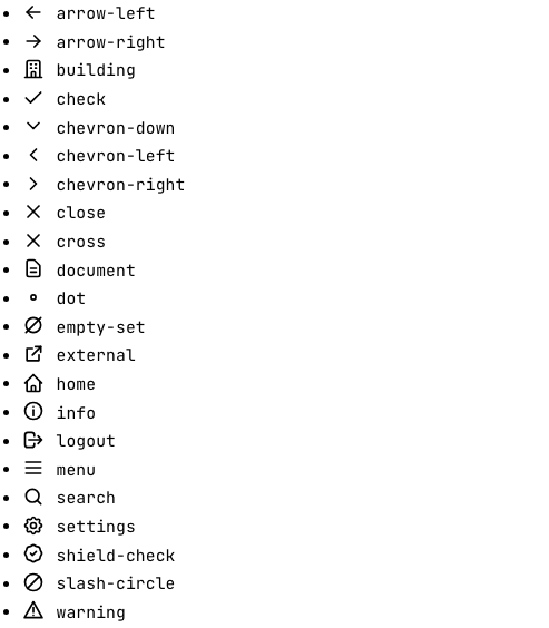
A drawing that goes with a word. Twenty-three stroke icons on a 24-unit grid, drawn in the current colour, so they follow the ink in both themes and under forced colours. The icon is never the message: the word is, and the icon is hidden from assistive technology whatever the caller does.
When to use, when not
Use it next to a label in a control, a chip, a heading or a navigation entry, when the shape helps a sighted reader find it faster. Do not use it alone, and do not use it where a character does the job: an audit status in running text or a document takes the symbol from @rgaa-dev/core.
Anatomy
- An
svgwitharia-hidden="true"andfocusable="false". - One or more
pathelements fromicons/paths.ts, generated fromicons/svg.
Props
| Name | Type | Default | What it does |
|---|---|---|---|
name | IconName | Which drawing, from icons/svg. A status takes its name from `statusIcon`. | |
size? | 'sm' | 'md' | 'lg' | 'md' | `sm` sits in small text and chips, `md` in body text and buttons, `lg` in headings. |
class? | string | '' | Layout classes only: a margin, a colour. The size comes from `size`. |
States
The three sizes, the five status drawings with their words, and the whole set.
all
The whole set, each with its name, so a contributor sees what exists before drawing a new one.
Light
-
arrow-left -
arrow-right -
building -
check -
chevron-down -
chevron-left -
chevron-right -
close -
cross -
document -
dot -
empty-set -
external -
home -
info -
logout -
menu -
more -
search -
settings -
shield-check -
slash-circle -
warning
Dark
-
arrow-left -
arrow-right -
building -
check -
chevron-down -
chevron-left -
chevron-right -
close -
cross -
document -
dot -
empty-set -
external -
home -
info -
logout -
menu -
more -
search -
settings -
shield-check -
slash-circle -
warning
320 px, light
-
arrow-left -
arrow-right -
building -
check -
chevron-down -
chevron-left -
chevron-right -
close -
cross -
document -
dot -
empty-set -
external -
home -
info -
logout -
menu -
more -
search -
settings -
shield-check -
slash-circle -
warning
320 px, dark
-
arrow-left -
arrow-right -
building -
check -
chevron-down -
chevron-left -
chevron-right -
close -
cross -
document -
dot -
empty-set -
external -
home -
info -
logout -
menu -
more -
search -
settings -
shield-check -
slash-circle -
warning
216 px, light
-
arrow-left -
arrow-right -
building -
check -
chevron-down -
chevron-left -
chevron-right -
close -
cross -
document -
dot -
empty-set -
external -
home -
info -
logout -
menu -
more -
search -
settings -
shield-check -
slash-circle -
warning
Forced colours, captured
large
Light
Dark
320 px, light
320 px, dark
216 px, light
Forced colours, captured

medium
Light
Dark
320 px, light
320 px, dark
216 px, light
Forced colours, captured

small
Light
Dark
320 px, light
320 px, dark
216 px, light
Forced colours, captured

statuses
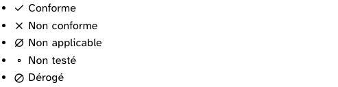
Each status drawing with the word from core: the pairing a caller gets through statusIcon.
Light
- Conforme
- Non conforme
- Non applicable
- Non testé
- Dérogé
Dark
- Conforme
- Non conforme
- Non applicable
- Non testé
- Dérogé
320 px, light
- Conforme
- Non conforme
- Non applicable
- Non testé
- Dérogé
320 px, dark
- Conforme
- Non conforme
- Non applicable
- Non testé
- Dérogé
216 px, light
- Conforme
- Non conforme
- Non applicable
- Non testé
- Dérogé
Forced colours, captured
Accessibility contract
- Role and name: none. The svg is hidden; the parent’s text is the name.
- Keyboard and focus: none;
focusable="false"keeps old Edge from tabbing to it. - Colour:
currentColor, so the icon has exactly the contrast of its text. - Forced colours: a stroke in
currentColoris repainted by the system palette like text.
Content rules
The word next to the icon says what the icon means, in French, visible or in rl-sr-only. A status icon comes with the status label from @rgaa-dev/core.
Do and don’t
- Do pick a status drawing through
statusIcon, never by shape. - Do not give the svg a title or a label: two names for one thing is one too many.
Examples
<Icon name="check" size="sm" /> Conforme
<Icon name={statusIcon.NC} /> <span class="rl-sr-only">Non conforme</span>
For an overlay written without Svelte, svgIcon('check', { size: 'sm' }) from @rgaa-dev/design/icons returns the same markup as a string.
Surfaces
- Site: the header and the sheet navigation, as they move to the atoms.
- App: the lab layout, as it moves to AppShell.
- Extension: the panel and the page furniture, through
svgIcon.
Related
StatusChip, Alert, Button.
Decisions
- 2026-09-24:
crossandcloseare the same drawing under two names, because they are two meanings: an audit verdict and a control that dismisses. A reader of the call site should know which one is meant. - 2026-09-24: the eight navigation drawings (menu, chevron-left, home, document, building, settings, shield-check, logout) are the lab layout’s, moved into the set as they were, so the rail does not change shape.
- 2026-09-24: no fill, no colour, only paths: a test on the source files refuses anything else, so an icon can be pasted from any set as long as it is redrawn on the grid.
Criteria held by construction
- 1.2, Chaque image de décoration est-elle correctement ignorée par les technologies d'assistance ?
The svg is always aria-hidden and focusable=false; assistive technology skips it and reads the word next to it.
Tokens it reads
- Spacing:
--rl-icon-lg,--rl-icon-md,--rl-icon-sm