molecule · stable · app · since 2026-09
PasswordField
Purpose
A password field with a control that shows what is typed. Field for the label, the hint and the error; under it a button with aria-pressed that switches the input between password and text, keeps the focus, keeps the value, and keeps its name.
When to use, when not
Use it wherever a password is typed: sign in, register, choose a new one, confirm one. Not for a one-time code, which is OTPField; not for a secret the user never types (an API key shown once is a CodeBlock).
Anatomy
- Field: the label, the hint, the input, the error.
- The toggle, under the input, in Field’s slot.
Props
| Name | Type | Default | What it does |
|---|---|---|---|
id | string | The control's id; the label's `for` is the same value. | |
label | string | The visible label: "Mot de passe", "Nouveau mot de passe". | |
value? | string | undefined | The value, bindable; absent reads as empty. | |
name? | string | The name sent with the form. | |
required? | boolean | false | Required: the word goes into the accessible name and the attribute onto the control. |
hint? | string | undefined | A help sentence, announced with the field: the rules of a new password. | |
error? | string | undefined | The error message; its presence alone marks the field invalid. | |
autocomplete? | FullAutoFill | 'current-password' | `current-password` at sign-in, `new-password` when choosing one: the password manager fills the right one. |
minlength? | number | The shortest password accepted, for a new one. | |
showLabel? | string | 'Afficher le mot de passe' | The toggle's name, the same whether the password shows or not; the state says which. |
States
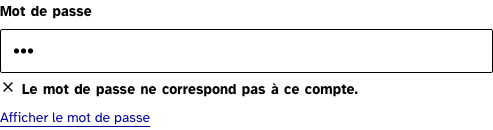
Sign-in, a new password with its rules, and an error.
error
The error tied to the control, read as an alert; the toggle still works.
Light
Le mot de passe ne correspond pas à ce compte.
Dark
Le mot de passe ne correspond pas à ce compte.
320 px, light
Le mot de passe ne correspond pas à ce compte.
320 px, dark
Le mot de passe ne correspond pas à ce compte.
216 px, light
Forced colours, captured
newPassword
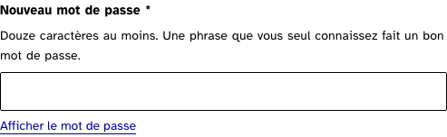
Choosing one: the rules in the hint, the manager told it is a new password.
Light
Douze caractères au moins. Une phrase que vous seul connaissez fait un bon mot de passe.
Dark
Douze caractères au moins. Une phrase que vous seul connaissez fait un bon mot de passe.
320 px, light
Douze caractères au moins. Une phrase que vous seul connaissez fait un bon mot de passe.
320 px, dark
Douze caractères au moins. Une phrase que vous seul connaissez fait un bon mot de passe.
216 px, light
Forced colours, captured
signIn
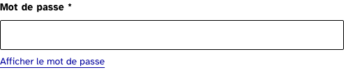
At sign-in: the current password, required, with the toggle under the field. Press it: the value shows, the button says it is pressed, the focus stays on it.
Light
Dark
320 px, light
320 px, dark
216 px, light
Forced colours, captured
Accessibility contract
- Role and name: the input named by the label; the toggle a button named “Afficher le mot de passe” with
aria-pressedandaria-controlson the input. - Keyboard, focus: Tab from the input to the toggle; Enter or Space toggles; the focus stays on the toggle. The value is kept through the toggle.
- Live regions: the error’s, from Field.
Content rules
French. The label is “Mot de passe” or “Nouveau mot de passe”; the toggle’s name stays “Afficher le mot de passe” in both states; the hint of a new password says the rule and gives advice.
Do and don’t
- Do give
autocomplete="new-password"when the user chooses one, and let the default say current-password at sign-in. - Do not change the toggle’s text to “Masquer”: the pressed state says it, and a name that changes under the focus confuses.
- Do not lay the toggle over the input: the browser’s own reveal control and the manager’s icon sit there.
Examples
<PasswordField id="password" label="Mot de passe" name="password" required bind:value={form.password} error={errors.password} />
<PasswordField id="new" label="Nouveau mot de passe" autocomplete="new-password" minlength={12} hint="Douze caractères au moins." />
Surfaces
- App: sign in, register, forgotten password, reset.
Related
Field, OTPField, Button.
Decisions
- 2026-09-26: a toggle with a constant name and
aria-pressedrather than a label that alternates: the state is announced, and the name a user learnt stays. - 2026-09-26: the toggle sits under the input, in Field’s slot, rather than inside the input’s box: the browser and the password manager already draw there.
Criteria held by construction
- 11.1, Chaque champ de formulaire a-t-il une étiquette ?
Field's label, tied by for and id; the toggle is a button named by its text. - 7.1, Chaque script est-il, si nécessaire, compatible avec les technologies d'assistance ?
The toggle is a native button with aria-pressed: the state is the one assistive technology knows, and the name never changes. - 11.13, La finalité d'un champ de saisie peut-elle être déduite pour faciliter le remplissage automatique des champs avec les données de l'utilisateur ?
autocomplete says current-password or new-password, so the manager fills or offers the right one. - 11.10, Dans chaque formulaire, le contrôle de saisie est-il utilisé de manière pertinente ?
The error and the hint are tied to the control as Field ties them.
Tokens it reads
- Colour:
--rl-action,--rl-action-hover - Typography:
--rl-weight-bold,--rl-text-sm