molecule · stable · since 2026-09
RadioGroup
Purpose
An exclusive choice among a few options, as native radio buttons in a fieldset with a legend. The shared name makes the group: exclusive, and one Tab stop with the arrows moving the choice.
When to use, when not
Use it for two to five options the user must see at once: a level, a status, a frequency. For more, or when the options need no comparing, Select. For independent options, Checkbox.
Anatomy
- The fieldset, with the legend as the question.
- The hint, tied to the group.
- The options, each a native radio with its label and an optional hint.
- The error, tied to the group, with the line of non-conformity along the options.
Props
| Name | Type | Default | What it does |
|---|---|---|---|
name | string | The shared name: it makes the group. Unique on the page. | |
legend | string | The question, as the legend. | |
options | Option[] | The options, in order. | |
value? | string | undefined | The chosen value; bindable, absent reads as no choice. | |
hint? | string | undefined | A help sentence, announced with the group. | |
error? | string | undefined | The error message, tied to the group; its presence draws the line of non-conformity around the options. | |
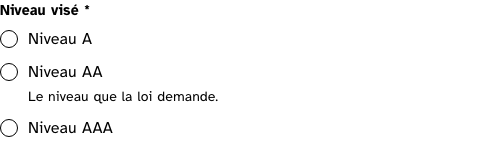
required? | boolean | false | Required: the word goes into the legend and the attribute onto the controls. |
inline? | boolean | false | The options side by side rather than stacked, for two or three short ones. |
States
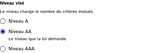
Plain, with a choice made, inline, required, and in error.
chosen
Light
Dark
320 px, light
320 px, dark
216 px, light
Forced colours, captured
error
The message tied to the fieldset and read as an alert; the line along the options draws it.
Light
Dark
320 px, light
320 px, dark
216 px, light
Forced colours, captured

inline
Light
Dark
320 px, light
320 px, dark
216 px, light
Forced colours, captured

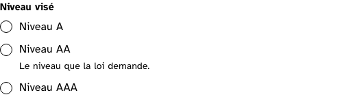
plain
One Tab stop for the group; the arrows move the choice. The legend is read before the options.
Light
Dark
320 px, light
320 px, dark
216 px, light
Forced colours, captured
required
Light
Dark
320 px, light
320 px, dark
216 px, light
Forced colours, captured
Accessibility contract
- Role and name: a group named by the legend; each radio named by its label.
- Keyboard, focus: one Tab stop, on the checked option or the first; the arrows move and check. The ring is the system’s.
- Live regions: the error is
role="alert".
Content rules
French. The legend is the question or the thing chosen (“Niveau visé”); the labels are the options as nouns; an option hint says what choosing implies.
Do and don’t
- Do give
namea value unique on the page: two groups with one name merge. - Do use
inlinefor two or three short options only. - Do not preselect an option when the choice matters; an empty group asks.
Examples
<RadioGroup name="level" legend="Niveau visé" options={levels} bind:value={level} required />Surfaces
- App: the dashboard’s status filter and the account sheet’s role, each option with its sentence.
- Extension: the status choice of a criterion, when the panel is on Svelte.
Related
Checkbox, Select, Field.
Decisions
- 2026-09-24: no
aria-invalidanywhere: a radio does not carry it and a fieldset cannot be invalid. The error is tied to the group byaria-describedby, read as an alert, and drawn by a line along the options.
Criteria held by construction
- 11.5, Dans chaque formulaire, les champs de même nature sont-ils regroupés, si nécessaire ?
The options are grouped in a fieldset; the component cannot render them outside one. - 11.6, Dans chaque formulaire, chaque regroupement de champs de formulaire a-t-il une légende ?
The legend is required and is the question, read before the options. - 11.1, Chaque champ de formulaire a-t-il une étiquette ?
Every option has a label associated by for and id, generated from one prop. - 12.8, Dans chaque page web, l'ordre de tabulation est-il cohérent ?
One name for the group, so the options cost one Tab stop and the arrows move the choice.
Tokens it reads
- Colour:
--rl-action,--rl-ink,--rl-ink-soft,--rl-nc,--rl-focus,--rl-focus-offset,--rl-focus-width - Typography:
--rl-weight-bold,--rl-text-sm - Spacing:
--rl-space-1,--rl-space-1-5,--rl-space-2,--rl-space-2-5,--rl-space-3,--rl-space-6 - Layout:
--rl-border-strong