molecule · stable · since 2026-09
Tabs
Purpose
Views of equal weight, one shown at a time. The component of the system that needs the most ARIA, and the reason it is one: nothing in HTML makes a tab list, so the roles, the selected state, the relations and above all the keyboard path must be declared, and the point everyone misses is that Tab does not walk the tabs.
When to use, when not
Use it for two to six views of the same thing the user switches between: the detection, the assistants and the report of a page; the light and dark set of a token. Do not use it for sequential steps (a wizard), for sections a reader scrolls through (headings), or for content the page needs read at once.
Anatomy
- The tab list, named, with one button per view.
- The selected tab, its line joining the panel.
- The panels, one shown, each named by its tab and able to take the focus.
Props
| Name | Type | Default | What it does |
|---|---|---|---|
tabs | Tab[] | The tabs, in order. | |
selected? | string | undefined | The id of the selected tab; bindable. The first tab when absent. | |
label | string | The name of the tab list, said before the tabs: "Ce que fait l'extension, liste d'onglets". | |
class? | string | '' | Layout classes only. |
panel | Snippet<[Tab]> | The content of one panel, given its tab. |
States
The first tab selected, and another selected at first render.
plain
One Tab stop for the whole list; the arrows, Home and End move between tabs and show the panel at once.
Light
Le moteur passe soixante-deux règles ACT sur la page et rattache chaque relevé à son critère. Il ne prononce jamais de verdict : il apporte une preuve.
Quatorze assistants conduisent les vérifications que rien n'automatise, une question à la fois.
Le taux de conformité, les critères tranchés, les preuves attachées : l'audit s'exporte tel qu'il se relira dans six mois.
Dark
Le moteur passe soixante-deux règles ACT sur la page et rattache chaque relevé à son critère. Il ne prononce jamais de verdict : il apporte une preuve.
Quatorze assistants conduisent les vérifications que rien n'automatise, une question à la fois.
Le taux de conformité, les critères tranchés, les preuves attachées : l'audit s'exporte tel qu'il se relira dans six mois.
320 px, light
Le moteur passe soixante-deux règles ACT sur la page et rattache chaque relevé à son critère. Il ne prononce jamais de verdict : il apporte une preuve.
Quatorze assistants conduisent les vérifications que rien n'automatise, une question à la fois.
Le taux de conformité, les critères tranchés, les preuves attachées : l'audit s'exporte tel qu'il se relira dans six mois.
320 px, dark
Le moteur passe soixante-deux règles ACT sur la page et rattache chaque relevé à son critère. Il ne prononce jamais de verdict : il apporte une preuve.
Quatorze assistants conduisent les vérifications que rien n'automatise, une question à la fois.
Le taux de conformité, les critères tranchés, les preuves attachées : l'audit s'exporte tel qu'il se relira dans six mois.
216 px, light
Le moteur passe soixante-deux règles ACT sur la page et rattache chaque relevé à son critère. Il ne prononce jamais de verdict : il apporte une preuve.
Quatorze assistants conduisent les vérifications que rien n'automatise, une question à la fois.
Le taux de conformité, les critères tranchés, les preuves attachées : l'audit s'exporte tel qu'il se relira dans six mois.
Forced colours, captured
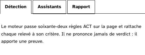
preset
The second tab selected at first render.
Light
Le moteur passe soixante-deux règles ACT sur la page et rattache chaque relevé à son critère. Il ne prononce jamais de verdict : il apporte une preuve.
Quatorze assistants conduisent les vérifications que rien n'automatise, une question à la fois.
Le taux de conformité, les critères tranchés, les preuves attachées : l'audit s'exporte tel qu'il se relira dans six mois.
Dark
Le moteur passe soixante-deux règles ACT sur la page et rattache chaque relevé à son critère. Il ne prononce jamais de verdict : il apporte une preuve.
Quatorze assistants conduisent les vérifications que rien n'automatise, une question à la fois.
Le taux de conformité, les critères tranchés, les preuves attachées : l'audit s'exporte tel qu'il se relira dans six mois.
320 px, light
Le moteur passe soixante-deux règles ACT sur la page et rattache chaque relevé à son critère. Il ne prononce jamais de verdict : il apporte une preuve.
Quatorze assistants conduisent les vérifications que rien n'automatise, une question à la fois.
Le taux de conformité, les critères tranchés, les preuves attachées : l'audit s'exporte tel qu'il se relira dans six mois.
320 px, dark
Le moteur passe soixante-deux règles ACT sur la page et rattache chaque relevé à son critère. Il ne prononce jamais de verdict : il apporte une preuve.
Quatorze assistants conduisent les vérifications que rien n'automatise, une question à la fois.
Le taux de conformité, les critères tranchés, les preuves attachées : l'audit s'exporte tel qu'il se relira dans six mois.
216 px, light
Le moteur passe soixante-deux règles ACT sur la page et rattache chaque relevé à son critère. Il ne prononce jamais de verdict : il apporte une preuve.
Quatorze assistants conduisent les vérifications que rien n'automatise, une question à la fois.
Le taux de conformité, les critères tranchés, les preuves attachées : l'audit s'exporte tel qu'il se relira dans six mois.
Forced colours, captured
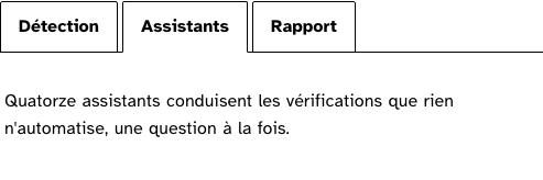
Accessibility contract
- Role and name:
tablistnamed bylabel;tabfor each button witharia-selectedandaria-controls;tabpanelnamed by its tab witharia-labelledby. - Keyboard, focus: one tab is in the tab order, the selected one. Left and Right move and select, wrapping; Home and End go to the ends. After the list, one Tab lands in the panel, which carries
tabindex="0". - Live regions: none; the selected tab announces itself.
- Activation is automatic: choosing a tab shows its panel. Right for light panels, which is the product’s case.
Content rules
French. Tab labels are one or two words, nouns (“Détection”, “Rapport”). The list’s name says what the tabs are views of.
Do and don’t
- Do give
labela name that reads before the tabs: “Ce que fait l’extension, liste d’onglets”. - Do not put a heading inside a tab; the tab is the name.
- Do not use tabs for a form split in steps.
Examples
<Tabs tabs={views} label="Le critère 1.1" bind:selected>
	{#snippet panel(tab)}<p>{texts[tab.id]}</p>{/snippet}
</Tabs>
Surfaces
- App: the report page’s view switcher; not ported yet.
- Extension: the wizard’s evidence and comment views, when the panel is on Svelte.
Related
Accordion, Disclosure.
Decisions
- 2026-09-24: automatic activation, from the site’s onglets demo, whose reasoning holds: the keyboard user discovers the panels by pressing the arrows.
- 2026-09-24: the panel takes the focus, so nothing inside it is out of reach when it scrolls.
Criteria held by construction
- 7.1, Chaque script est-il, si nécessaire, compatible avec les technologies d'assistance ?
tablist, tab and tabpanel with aria-selected, aria-controls and aria-labelledby: the roles and relations are declared in full, since HTML has none for this pattern. - 7.3, Chaque script est-il contrôlable par le clavier et par tout dispositif de pointage ?
The arrows, Home and End move between tabs and select; the panel takes the focus after the list, so a panel that scrolls is reachable. - 12.8, Dans chaque page web, l'ordre de tabulation est-il cohérent ?
One tab is in the tab order at a time: a group of six costs one Tab before the content, not six. - 3.1, Dans chaque page web, l'information ne doit pas être donnée uniquement par la couleur. Cette règle est-elle respectée ?
The selected tab is told by its line joining the panel and by its ink, not by colour alone.
Tokens it reads
- Colour:
--rl-bg,--rl-ink,--rl-ink-soft,--rl-line-strong - Typography:
--rl-weight-bold - Spacing:
--rl-space-1,--rl-space-2-5,--rl-space-4 - Layout:
--rl-radius,--rl-border,--rl-border-strong